
Real estate flyers remain one of the most powerful—and most underestimated—tools in a realtor's marketing arsenal. Done right, a well-designed property flyer can generate showing requests, spark bidding wars, and help you close faster. Done poorly, it ends up in the recycling bin before a buyer reads a single word. If you've ever wondered why some listings generate immediate buzz while others sit quietly on the market, the answer often starts with the marketing materials. This guide walks you through exactly how to design real estate flyers that actually convert buyers—from photo selection and headline writing to layout principles and the AI tools that make the whole process faster than ever.
What You Need Before You Start Designing
Before you open any design tool, gather these essential assets. Having everything ready upfront means you'll spend your time designing—not hunting for files.
- Hero photo: A high-resolution, professionally shot or AI-enhanced exterior or interior image (minimum 1500px wide for print)
- Supporting photos: 2-4 secondary images showcasing the kitchen, master bedroom, backyard, or standout features
- Property specs: Bedrooms, bathrooms, square footage, lot size, garage, year built, and listing price
- Key selling features: Renovated kitchen, new roof, pool, smart home tech, walkability score—whatever makes this property unique
- Neighborhood highlights: Top schools, proximity to transit, local amenities, lifestyle context
- Your contact information: Phone, email, website, QR code linking to the listing, and your brokerage logo
- Brand assets: Your headshot, brand colors, and fonts for consistency
Step-by-Step: Designing Real Estate Flyers That Convert
Step 1: Select a High-Impact Hero Photo
Your hero photo is doing 80% of the heavy lifting on any real estate flyer. It's the first thing a buyer's eye lands on, and it determines whether they keep reading or move on. Choose an image that communicates the property's best quality instantly—a sun-drenched kitchen, a dramatic exterior at dusk, or a beautifully staged living room. Avoid cluttered or dark photos. If your best shot is a daytime exterior on a gray day, consider using PropStage.ai's Twilight Photo Converter to transform it into a stunning blue-hour image that makes the property look warm, inviting, and premium—without rescheduling a shoot.
Step 2: Write a Buyer-Focused Headline
Most real estate flyers lead with the address or a generic label like 'New Listing!' That's a missed opportunity. Your headline should sell a lifestyle, not a location. Think about who your ideal buyer is and what they most want. A young family wants top-rated schools and a safe neighborhood. A remote professional wants a home office and high-speed internet. A downsizer wants low maintenance and walkability. Lead with what they care about most.
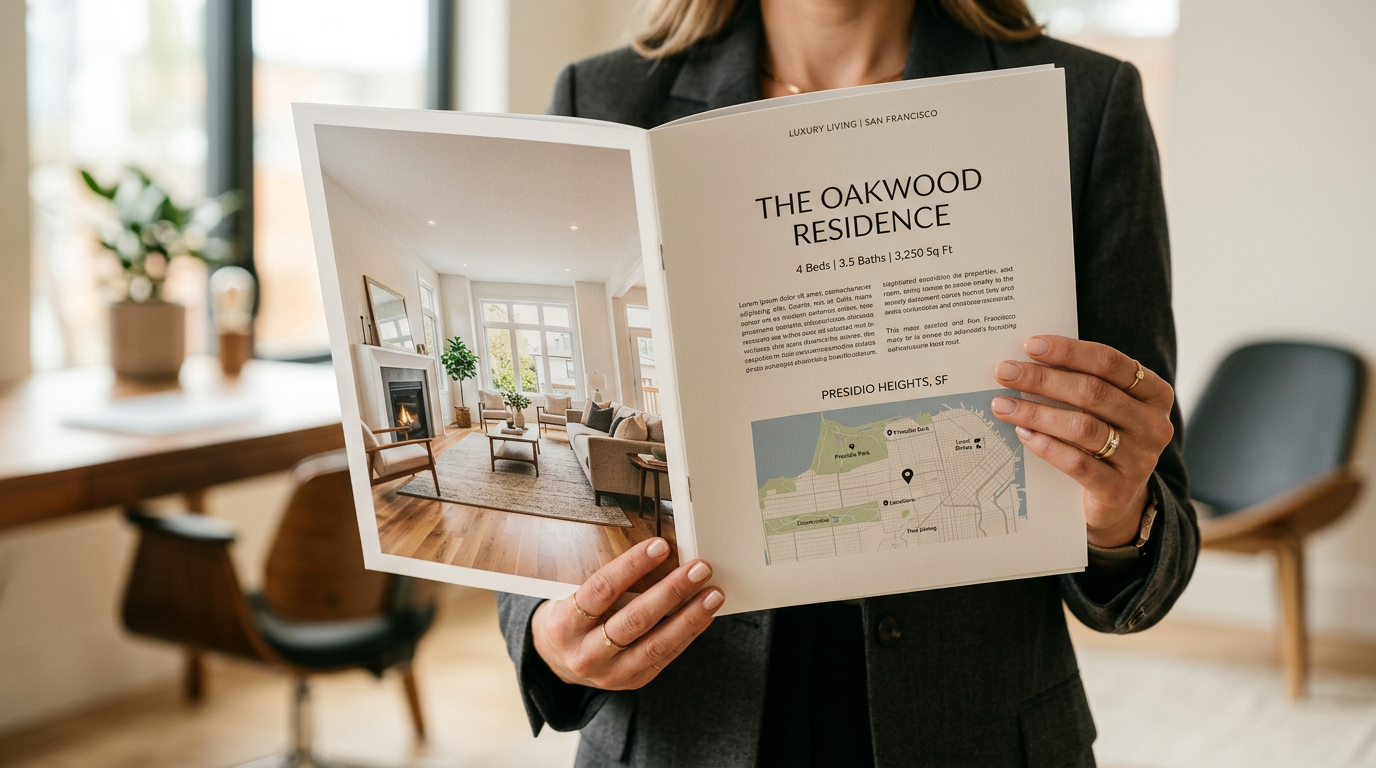
Step 3: Organize Property Details for Scannability
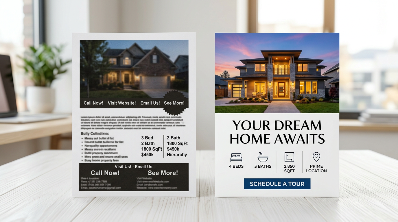
Buyers scan before they read. Your property specs should be presented in a clean, visually organized format—think icon-supported grids, bold numbers, or a simple two-column layout. Never bury the price. Never make someone search for the number of bedrooms. The goal is for a buyer to absorb the critical facts in under five seconds. Use whitespace generously. A cluttered flyer signals a cluttered listing.
Step 4: Add Neighborhood Context and Social Proof
Buyers aren't just purchasing four walls—they're buying a lifestyle and a community. Dedicate a small section of your flyer to neighborhood highlights: walkability score, nearby restaurants or parks, school district ratings, commute times to major employment centers, or recent neighborhood developments. If you have a brief testimonial from a past client in the area, even better. Social proof builds trust faster than any spec sheet.
Step 5: Design a Clear, Compelling Call-to-Action
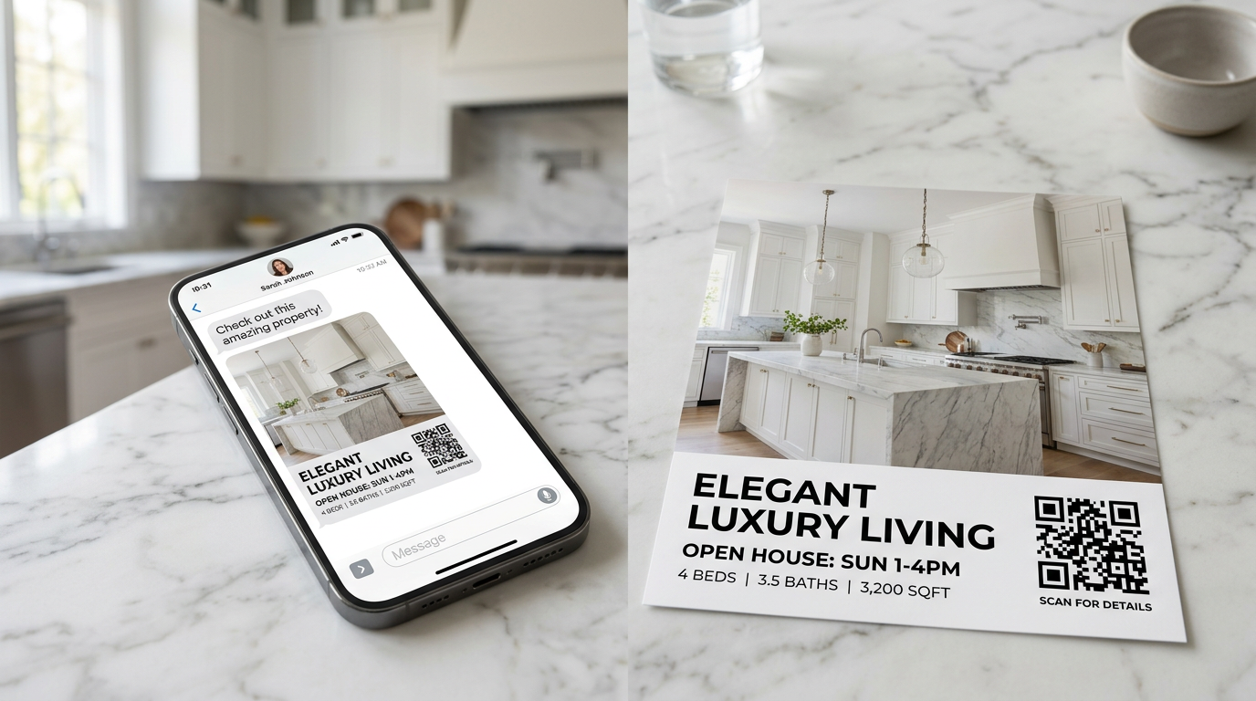
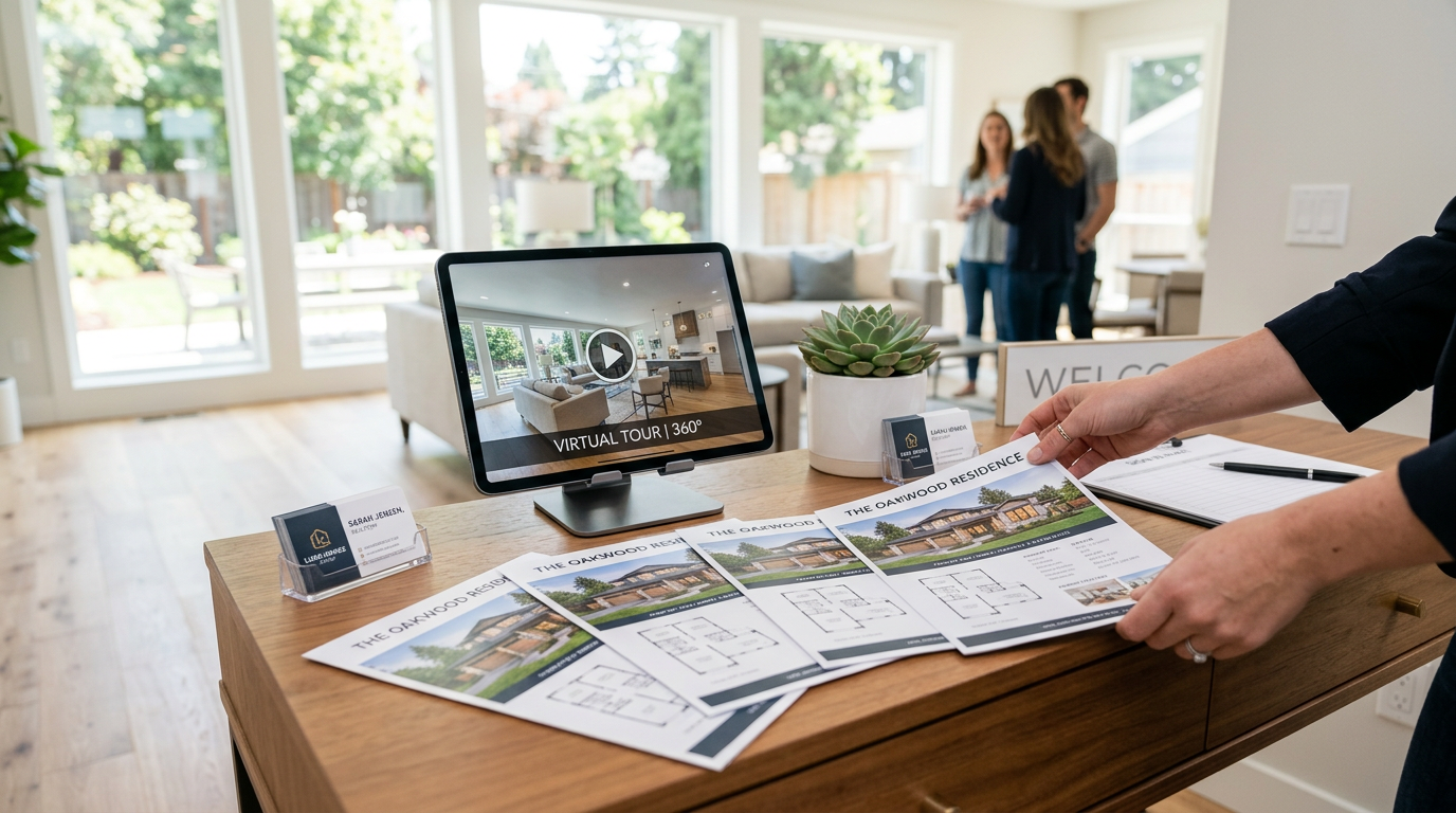
Every high-converting real estate flyer has one primary call-to-action. Not three. Not five. One. Decide what you want the buyer to do next—call you, visit a landing page, scan a QR code, or schedule a showing—and make that action the most visually prominent element after your hero photo and headline. Use a contrasting color for your CTA button or text block. Include a QR code that links directly to the listing page, a 3D tour, or a showing scheduler. Make it frictionless.
Step 6: Generate Your Flyer with an AI-Powered Tool
Here's where the process gets dramatically faster. Instead of spending hours in Canva or InDesign, use PropStage.ai's Property Flyer & Brochure Creator to generate a print-ready, professionally designed flyer in seconds. Upload your hero photo, enter your listing details, and the AI handles layout, typography, and visual hierarchy—producing polished results that look like they came from a professional graphic designer. You get print-ready files and digital versions optimized for email and social media, all without hiring outside help or waiting days for revisions.
Pro Tips for Real Estate Flyer Design That Pros Swear By
Tip 1: Design for Both Print and Digital from the Start
Your flyer needs to work in two very different environments: as a physical handout at an open house and as a digital asset shared via email, social media, and text message. Design with both in mind from the beginning. Use fonts no smaller than 10pt for print. Ensure your color contrast is strong enough for both backlit screens and printed paper. Save separate versions—a print-resolution PDF (300 DPI) and a compressed digital version optimized for web.
Tip 2: Keep Your Brand Consistent Across Every Listing
Buyers who see multiple listings from the same agent start to recognize—and trust—that agent's brand. Use consistent fonts, colors, and logo placement across every flyer you produce. Consistency signals professionalism and makes your marketing materials instantly recognizable.
Tip 3: Use Seasonal and Daylight Variations Strategically
A property listed in January with summer exterior photos feels more appealing than one showing snow-covered landscaping. If your listing spans multiple seasons, consider creating seasonal variants of your hero photo to keep marketing materials feeling current throughout a longer listing period.
Tip 4: Test Your Flyer Before Mass Distribution
Before printing 500 copies or blasting your email list, test your flyer. Send it to a colleague and ask: 'What's the first thing you notice? What would you do next?' Check that your QR code actually works. Print a single test copy to verify colors and font sizes look right in physical form.
Common Real Estate Flyer Mistakes That Kill Conversions
- Too much text: Buyers don't read walls of copy. Edit ruthlessly—if a sentence doesn't help a buyer make a decision, cut it.
- Low-quality or unedited photos: Blurry, dark, or cluttered photos signal a lack of professionalism before a buyer reads a single word.
- Missing or buried contact information: Make it impossible not to find your phone number and email.
- No clear CTA: If buyers don't know what to do next, they do nothing.
- Inconsistent branding: Mismatched fonts, colors, or logos undermine trust and make your materials look amateur.
- Ignoring mobile viewers: If your digital flyer requires pinching and zooming on a phone, most buyers will abandon it immediately.
Conclusion: Better Flyers, Faster Results
Designing real estate flyers that convert buyers isn't about having a graphic design degree or an expensive software subscription. It's about understanding what buyers respond to—great photos, clear benefits, scannable information, and a frictionless next step—and then executing that formula consistently across every listing. With AI-powered tools like PropStage.ai's Property Flyer & Brochure Creator, you can generate professional, print-ready flyers in the time it used to take just to open a design template. Start with a stunning photo, lead with the buyer's lifestyle, and make it effortless for them to take the next step. That's the formula for flyers that don't just look good—they actually close deals.